CETA Website Redesign is a UI/UX design project that develops a new brand identity and interactive website prototype for the Clinic to End Tech Abuse (CETA), a first-of-its-kind clinic helping survivors of intimate partner violence who are experiencing technology-facilitated abuse.
The project encompasses a complete design system—color palette, typography, UI components, and logo—along with a multi-page Figma prototype that was iteratively refined through self-critique and user-centered evaluation.
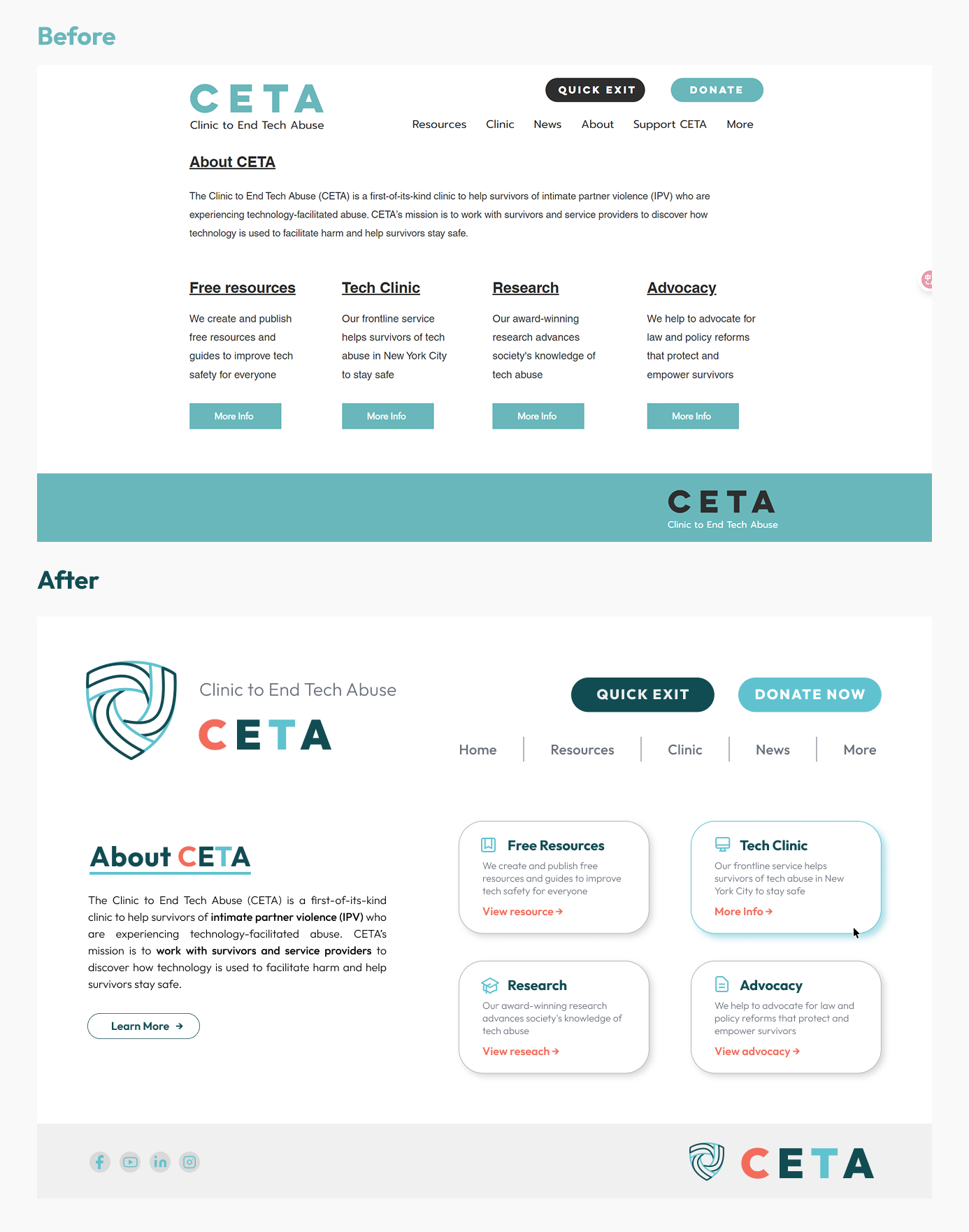
CETA's original website uses a minimal blue palette that, while clean, lacks the warmth and professionalism needed to communicate trust to survivors, clinics, and researchers. The redesign addresses this gap by creating a visual identity that balances technical credibility with an approachable, caring tone.
The central design question was:
How can a website simultaneously convey safety, professionalism, and accessibility for users who may be in vulnerable situations?
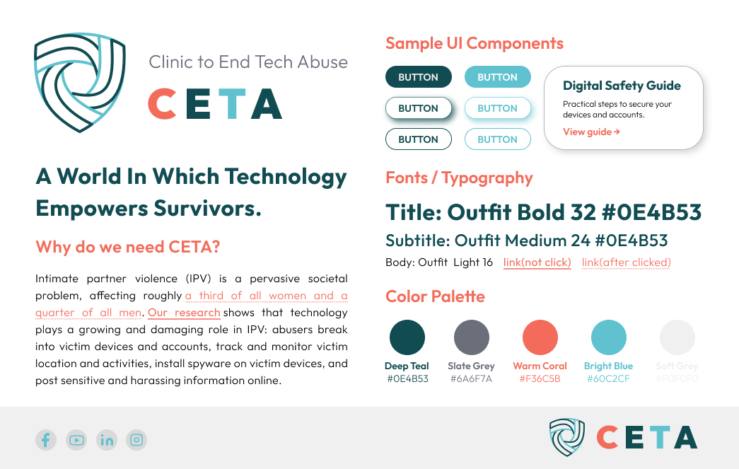
Color Palette
The redesigned palette retains bright blue as a core color to signal "tech," while introducing two key additions:
- Deep Teal (#0E4B53) — the primary brand color, conveying professionalism and stability
- Warm Coral (#F36C5B) — an accent color that introduces a caring, human quality
- Slate Grey (#6A6F7A) and Soft Grey — neutral tones for dividers and backgrounds that maintain readability
This combination moves beyond the original monochromatic scheme to create an identity that feels both trustworthy and emotionally approachable.
Typography
The system uses Outfit as a single type family for consistency across all contexts:
- Titles: Outfit Bold 32 in deep teal for strong visual hierarchy
- Subtitles: Outfit Medium 24
- Body text: Outfit Light 16 with distinct link states (color shift after click)
The single-family approach reduces cognitive load and ensures the system remains maintainable.
Logo Design
The logo combines an interwoven shield mark rendered in deep and bright teal, symbolizing protection and collective support. The woven bands within the shield subtly embed letterforms: the double curve in deep teal suggests "C" and strokes in bright blue hint at "T," quietly referencing Clinic and Tech.
The style tile establishes reusable components that appear throughout the website:
- Primary and secondary buttons with rounded corners and high contrast
- Card pattern for presenting resources, services, and research areas
- Navigation bar with Quick Exit and Donate Now as prominent actions
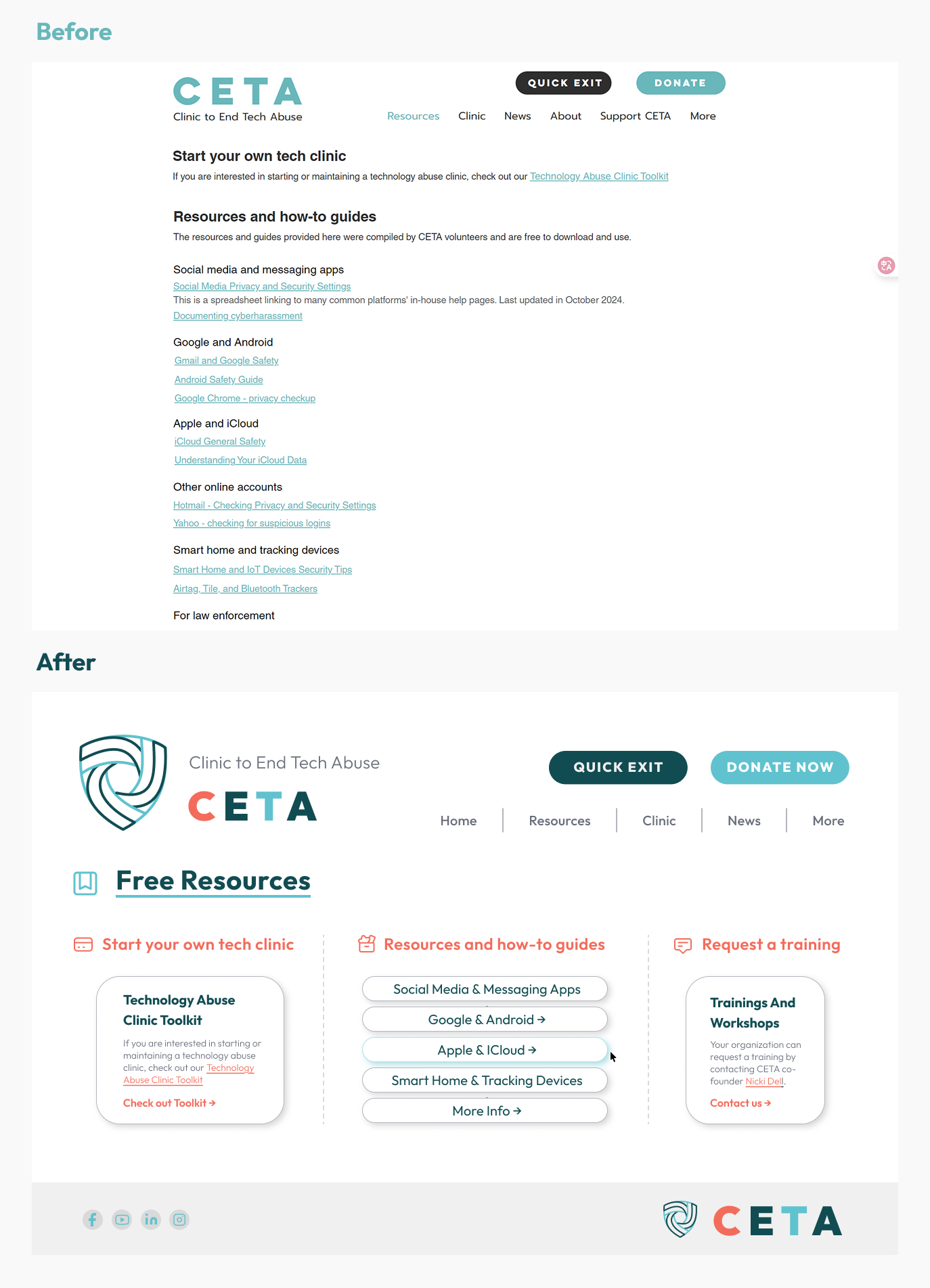
The Quick Exit button is a critical safety feature—it allows users in dangerous situations to instantly leave the site. Its prominent placement in the header reflects a survivor-centered design priority.
The Figma prototype includes two main pages:
Home Page
The home page introduces CETA's mission with a hero section, followed by a four-card grid presenting the organization's core pillars: Free Resources, Tech Clinic, Research, and Advocacy. Each card uses a consistent icon-title-description-link pattern.
Free Resources Page
This page organizes CETA's offerings into three columns: Start your own tech clinic (Technology Abuse Clinic Toolkit), Resources and how-to guides (organized by platform—Social Media, Google & Android, Apple & iCloud, Smart Home & Tracking Devices), and Request a training (Trainings and Workshops contact).
A structured self-critique identified five specific improvements:
- Typography fix — Corrected "Adocacy" to "Advocacy" in the card labels
- Layout consistency — The Free Resources page mixed card and pill-button patterns; unified to a consistent layout
- Visual dividers — Replaced dashed vertical lines between columns with whitespace and subtle background differences
- Button clarity — Changed the ambiguous "View All" button to "Learn More" for clearer intent
- Icon differentiation — Replaced identical "arrow-in-box" icons (which resembled logout/login buttons) with unique, meaningful symbols for each section header
These changes were implemented in a second prototype iteration, demonstrating a complete design-evaluate-refine cycle.
The project delivered:
- A cohesive brand identity system (palette, typography, logo, components)
- A multi-page interactive Figma prototype
- A documented critique-and-iteration cycle showing design maturity
- A survivor-centered design approach with safety features (Quick Exit) embedded in the interface
The redesign demonstrates how visual design decisions—color warmth, button placement, icon clarity—directly serve the needs of vulnerable users.
This project sharpened my understanding of how brand identity and UI design intersect with user safety. Designing for survivors of tech abuse required thinking beyond aesthetics to consider how every element—from color temperature to button labeling—communicates trust and enables quick action.
The self-critique process was particularly valuable. Identifying and articulating specific design flaws, then systematically addressing each one, reinforced the importance of iterative refinement in producing professional-quality work.